
Projects / The Janitor CartThe Janitor Cart
A B2B SaaS menagement plataform for janitorial and cleaning.

The Janitor Cart is an operations management platform built for cleaning and maintenance crews who need efficiency, clarity, and speed in their daily workflows.
Unlike traditional enterprise software built around corporate environments, The Janitor Cart is designed for teams working in fast-paced, hands-on operational contexts where usability directly impacts productivity.
The goal of this project was to completely redesign the product experience and create a scalable design system that could support future growth while staying true to the product’s practical, no-nonsense philosophy.
My role
Conducted discovery and workflow analysis to understand operational routines, task management processes, and reporting needs within cleaning operations.
Reviewed existing product limitations and gathered insights from internal stakeholders and operational teams.
UX Research
Restructured the information architecture to better reflect real-world operational workflows and user mental models.
Defined and optimized core user journeys with a focus on efficiency, clarity, and reduced cognitive load.
Aligned design decisions with scalability goals and design system integration.
Strategy
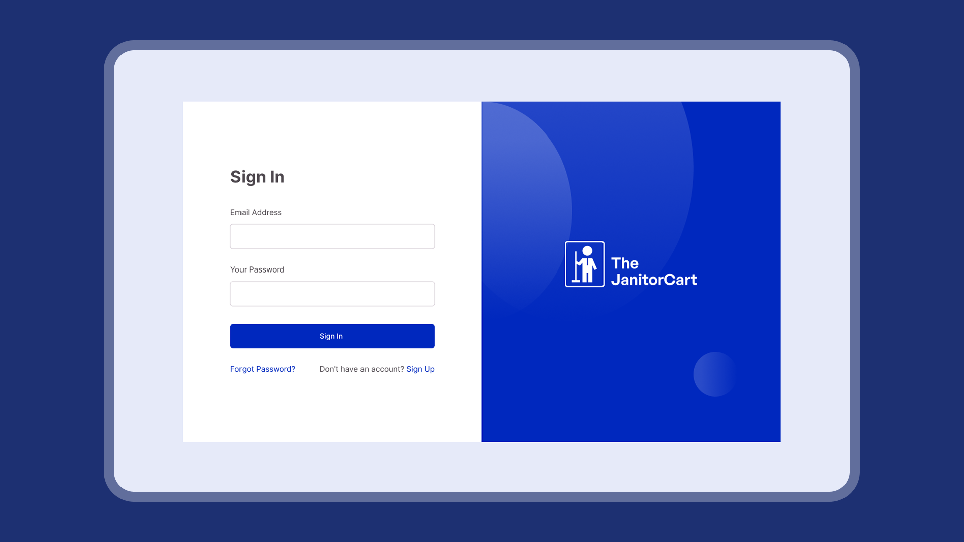
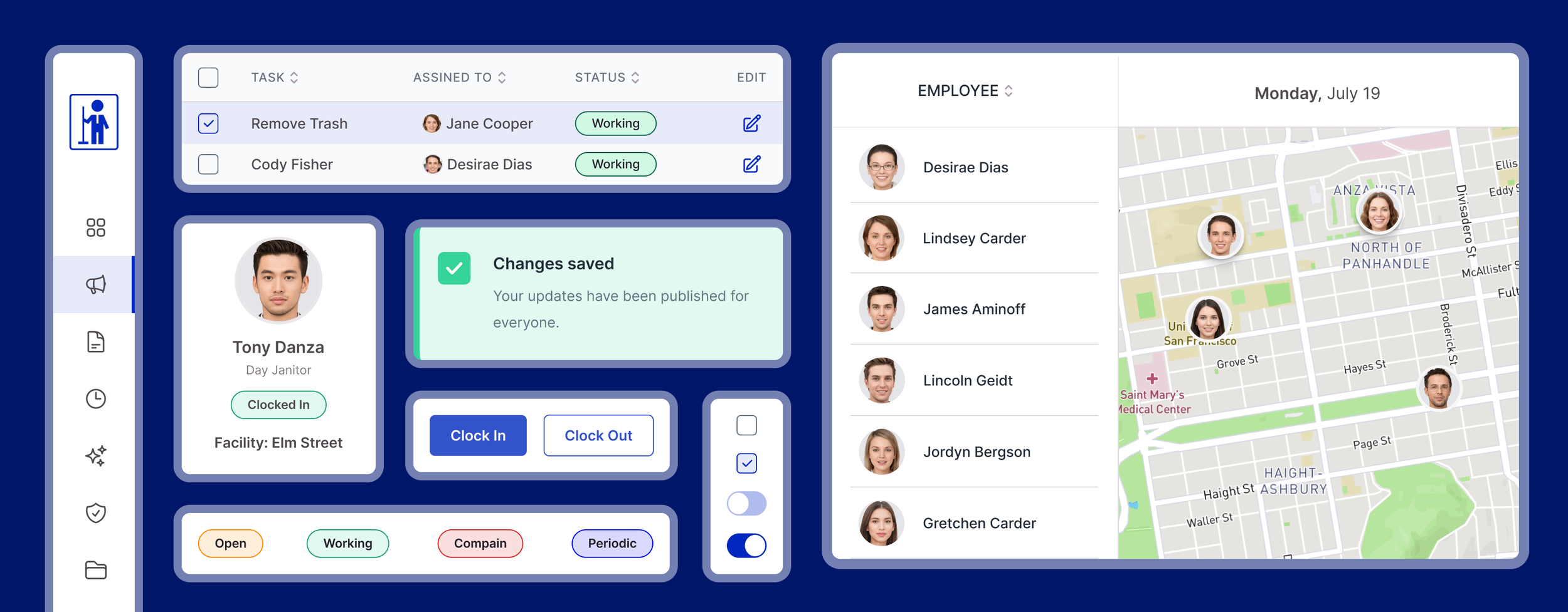
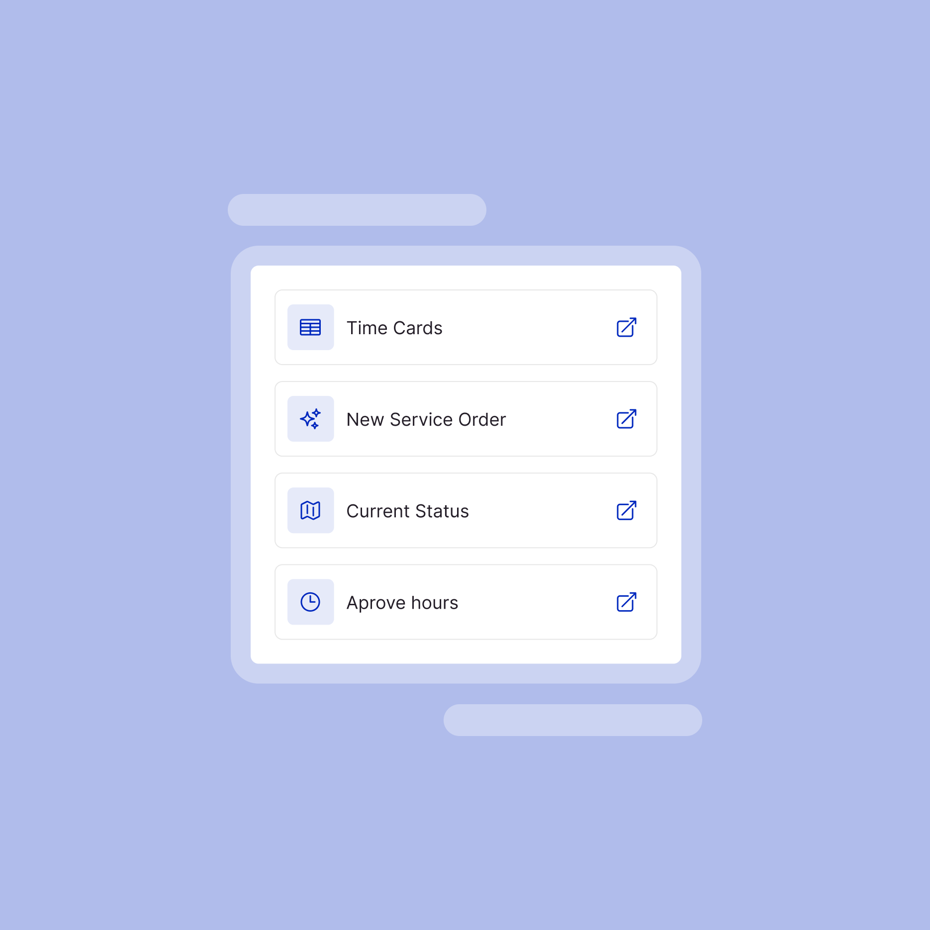
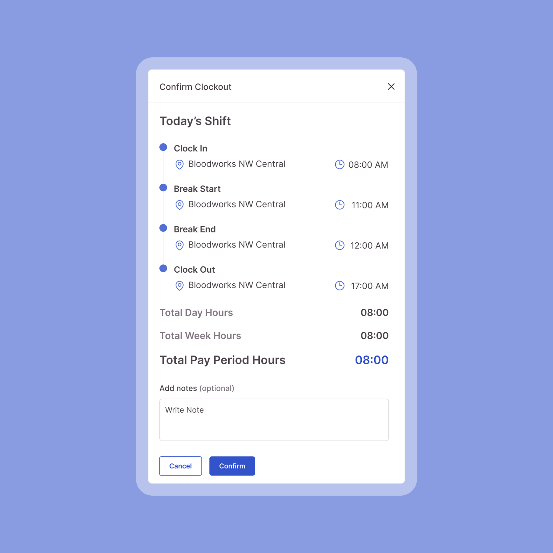
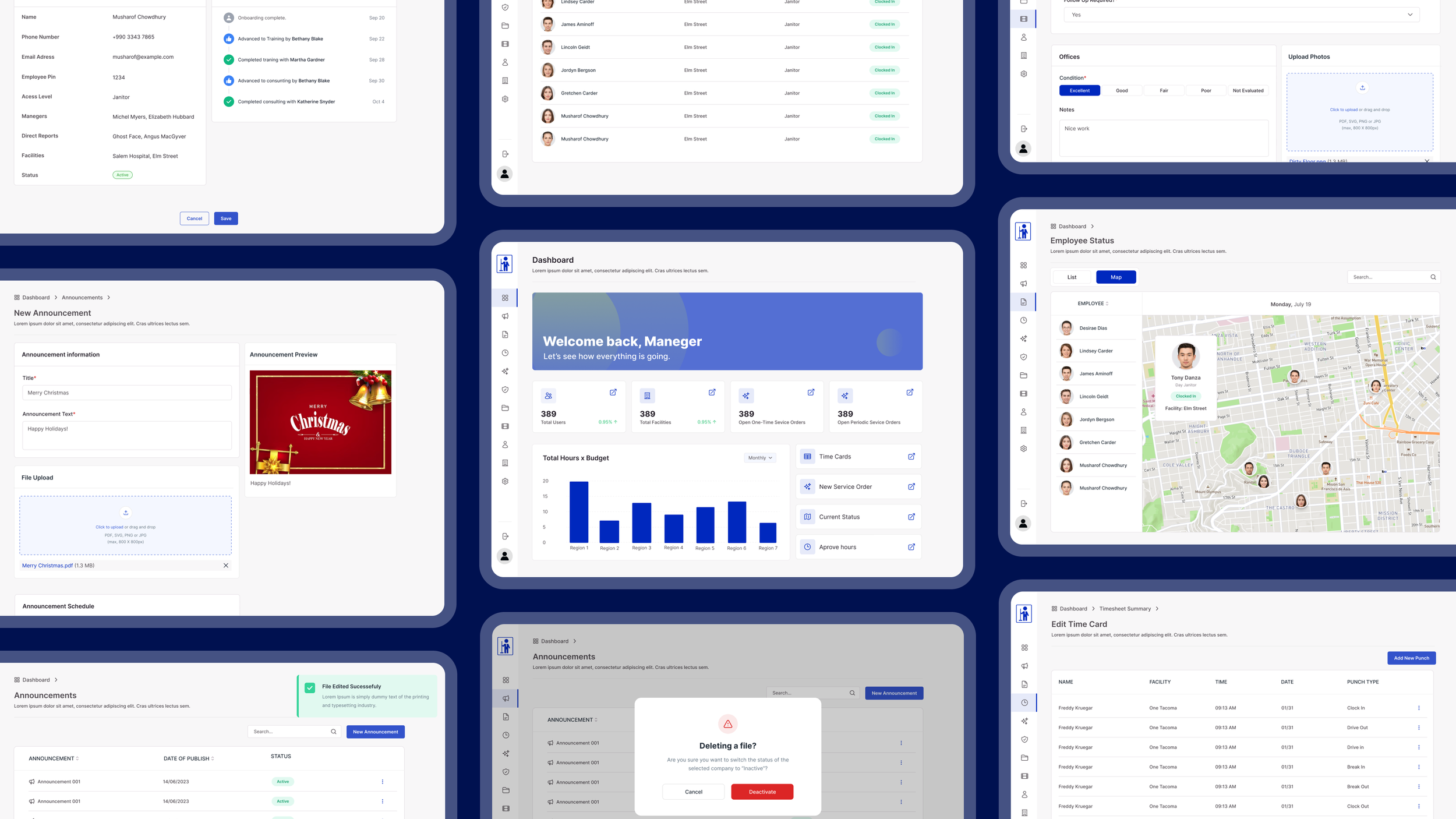
Created wireframes and interactive prototypes to validate usability and streamline critical workflows such as task tracking, checklist execution, and team monitoring.
Redesigned the platform interface with a focus on clarity, information hierarchy, and faster decision-making.
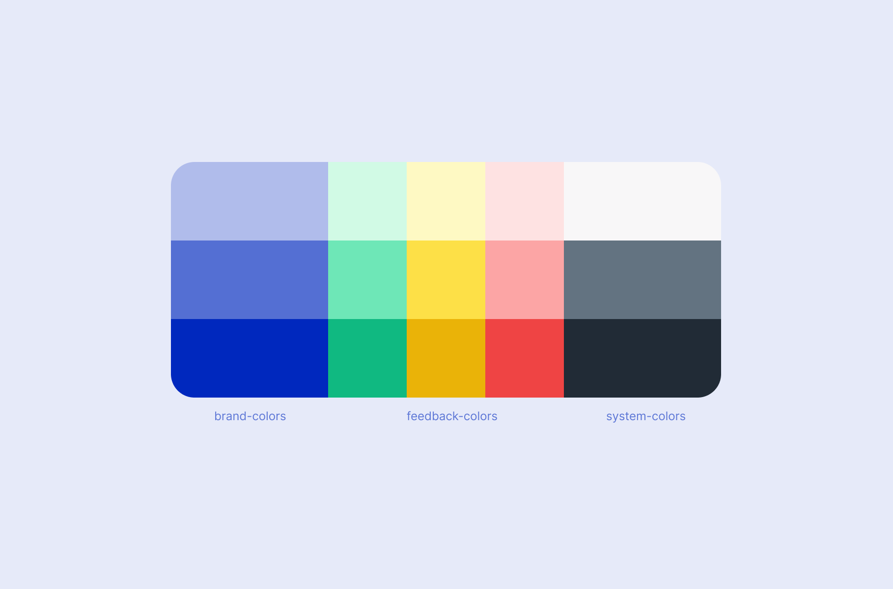
Introduced reusable components and accessibility considerations within the design system to support scalability and consistency.Collaborated closely with developers throughout implementation, ensuring design quality through documentation, handoff, and validation.
Design
The problem
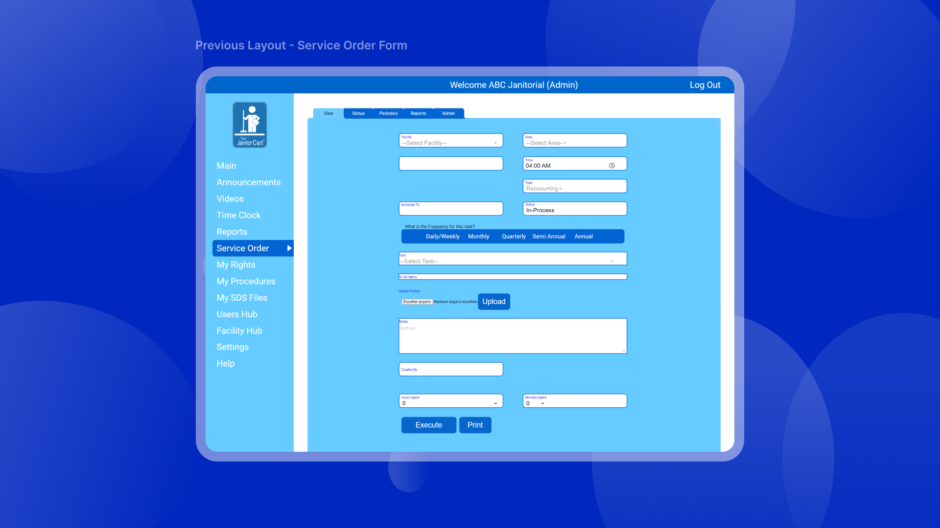
The existing platform provided powerful operational features but suffered from an outdated interface, inconsistent navigation patterns, and limited visual hierarchy. The experience felt cluttered, difficult to scan, and visually disconnected across different modules.
For users who rely on the system daily to manage schedules, reports, service orders, and compliance tasks, this friction translated directly into slower workflows and increased cognitive load.
Additionally, the product lacked a unified design system, which made it difficult to maintain consistency, scale new features, and ensure accessibility across the platform.


Design decisions focused on reducing cognitive load and improving operational efficiency while maintaining the reliability and accuracy required for workforce management, task tracking, and compliance processes.
Map key user flows to understand how they execute daily routines, track tasks, and document completion evidence.
Reorganized the information architecture better align with users’ mental models and the real dynamics of field operations.
Simplified core workflows, reducing friction in high-frequency, high-impact tasks.
We've introduced a clearer visual interface and interaction patterns to improve readability and understanding.
Ensured consistency across screens and components to create a cohesive product experience.
Design Process
Results
The redesign significantly improved usability and scalability across the platform. Users gained faster access to critical operational data through clearer dashboards and simplified navigation. The introduction of the design system streamlined collaboration between design and engineering while enabling faster and more consistent feature delivery.
Most importantly, the new experience maintained the product’s core identity, a straightforward, efficient tool built for real operational teams, while elevating its usability and long-term product sustainability.
Team
DesignAmanda Flôr Nardi
Edi Blanco