Projects / MoonzMoonz
An event platform designed to connect experiences

Moonz was born to make every event experience seamless: for those who create, and for those who live it.
Moonz is a digital platform designed to simplify the experience of both event clients and organizers. The goal is to make every step more accessible, practical, and enjoyable, from discovery to post-event. With a focus on innovation, personalization, and convenience, the platform connects people to meaningful and memorable experiences.
My role
Conducted a benchmark analysis of event platforms to identify navigation patterns, user flows, and key features;
UX Research
Structured the information architecture to serve two distinct user types: attendees (website and mobile app) and producers (web dashboard);
Planned core user flows with a focus on clarity, accessibility, and efficiency;
Strategy
Created wireframes and interactive prototypes to validate flow and usability;
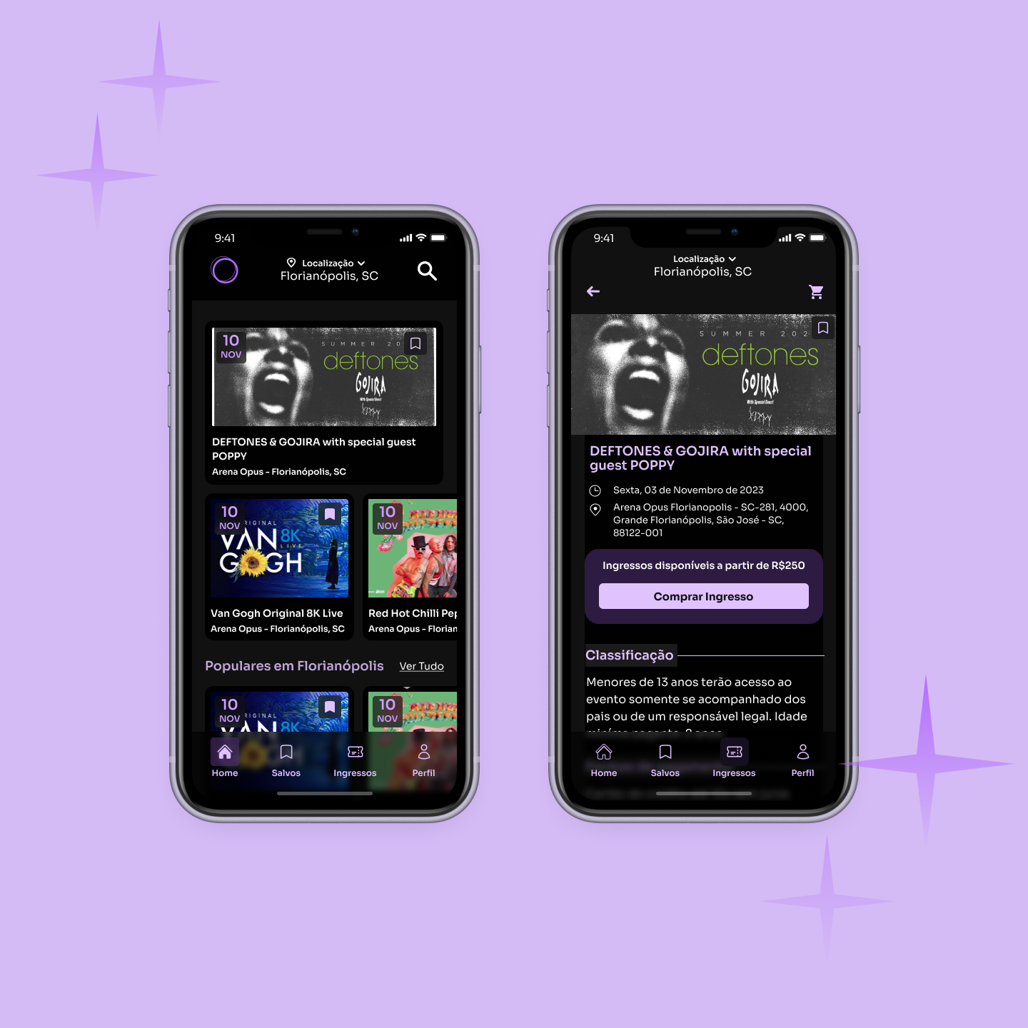
Designed the web mobile app interface with a focus on clean visuals, intuitive navigation, and responsive behavior;
Developed the producer’s dashboard (back-office) with clear information hierarchy, reusable components, and management efficiency in mind;
Delivered all assets in close collaboration with the dev team, ensuring design consistency through validation.
Design
Project Overview & Challenges
Moonz was envisioned as a complete digital solution, built from the ground up to serve two distinct user profiles: event attendees and organizers. The goal was ambitious: to develop a platform that was robust yet simple, offering a smooth journey for end users and a powerful management environment for producers.The main challenge was to design two parallel experiences in a cohesive way.
Starting Point

We needed to ensure a clear, intuitive, and accessible navigation flow from discovering an event to completing the registration process.
For customers

For event organizers
The focus was on delivering a comprehensive dashboard that included all the tools necessary to create, manage, track, and analyze their events without making the interface overly complex or technical.
Since the project was built from scratch, every design decision from information architecture to UI components was guided by research and user-centered validation, always considering scalability, usability, and long-term efficiency.
Research & Benchmarking
To ground the project in real user needs and industry standards, we began with an in-depth benchmark analysis of event platforms. This helped us identify common navigation patterns, user flows, and feature expectations. We also looked for usability gaps and innovation opportunities by comparing the strengths and weaknesses of competitors.


For customers
The experience was designed to be smooth, intuitive, and efficient across both the mobile app and the web version. Users could easily discover events by location, type, or date, access detailed information with visual clarity, and complete registrations quickly with immediate feedback. We created a seamless journey that minimized friction and encouraged active participation, regardless of the device used.


For Event Organizers
The platform offered event producers a comprehensive web-based dashboard to create and manage events, monitor registrations and sales in real time, and communicate directly with their customers. The interface was carefully structured with a clear hierarchy of information, incorporating robust features such as performance reports, historical comparisons, and sales projections, all within a modular and scalable design system. Both customer-facing and producer-facing experiences were developed to complement each other, ensuring that every interaction with the platform was efficient, cohesive, and user-centered.


Results
Moonz has already processed over 8,000 registrations through the platform, demonstrating its effectiveness and market relevance. The solution has received positive feedback from event organizers, especially for its usability and the convenience of centralized event management. The app navigation proved smooth, with low drop-off rates during the registration flow, reflecting the success of the user-centered design approach. Additionally, we built a scalable interface with reusable design components, ensuring consistency and efficiency as the platform grows.
Moonz’s impact and potential were further recognized when it was featured in ROCKET 2024, a startup reality show from RPC Paraná, which highlighted the product’s innovation in event management technology.

Team
DesignAmanda Flôr Nardi
CodeLeonardo Tolotti, Wallyson Breno da Silva
Product MenagementRamerson Junior
Team LeadersThiago Zampieri, Tiago Valese
